← All work
[02]Brand · AI film · Website· 2026
FILÓN
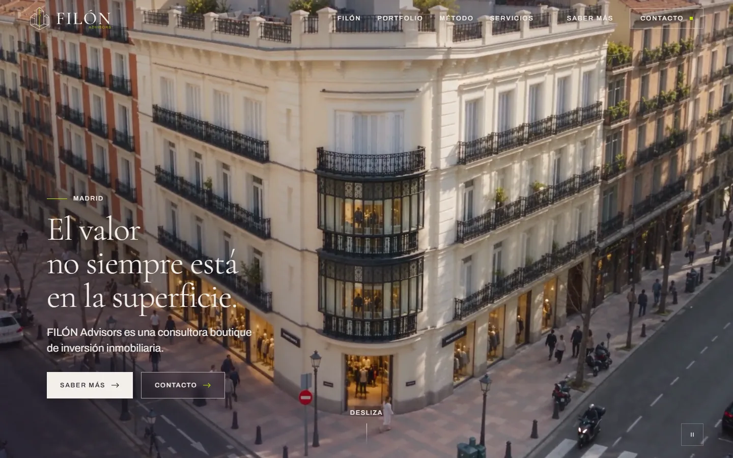
A Madrid real-estate investment boutique, from a blank page to live: the identity, the street signs, a 30-second AI film and the website at filonadvisors.com. The idea in one line: the value isn’t always on the surface.
[01]Overview
A seam of value, under the pavement.
A filón is a seam of ore. The firm finds value in buildings that others walk past, so the whole brand is one image: a vein of lime light running under a Madrid street.
The brief was short and specific: FILÓN had to dominate “Advisors”; the palette was berenjena, lima and marfil; the hidden-vein idea had to stay implicit — never a geology textbook — and the first thing the brand had to do in the real world was hang outside empty shops as a round “Disponible” sign.
I took it through every surface: the identity, print-ready signs in three colourways, the brand film made with AI video models, and the Next.js website the firm now uses to take enquiries.
01Identity & print-ready signage
0230-second film directed with Seedance
03Live website & leads dashboard
01
Mark & wordmark


The vein is the only colour. Everything else is outline, so it survives at favicon size and on a 1.5 m sign.
02
Palette
Berenjena
#2E1B2FThe ground. Dark fields, signs, footerLima
#B7E600The vein. Used sparingly, never as a fieldMarfil
#F2EFEAPaper, light fields, the stone at the surfacePiedra
#C8C2B6Secondary text on dark, sediment layersGrafito
#171716Ink on lightThe client gave three colours. I added two neutrals so the lime could stay rare.
03
Typography
Aa
Cormorant Garamond · headlines
Archivo · body, labels, UI
An old-money serif for trust, a plain grotesque for the numbers.
04
Three depths
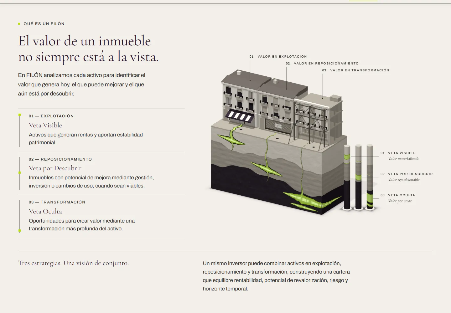
The firm’s three strategies (exploit, reposition, transform) became three depths of rock. The film, the site and the services all use them.
The brand’s first job: hang outside a shop.
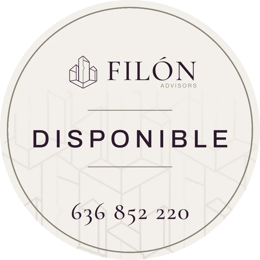
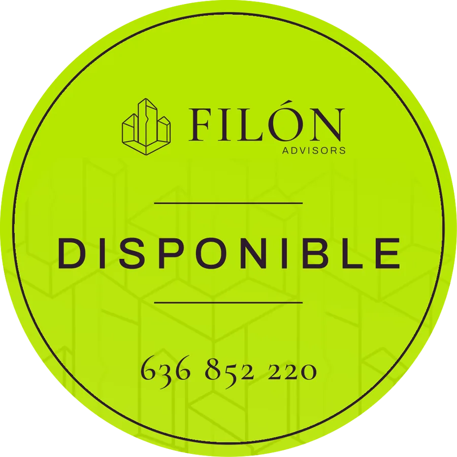
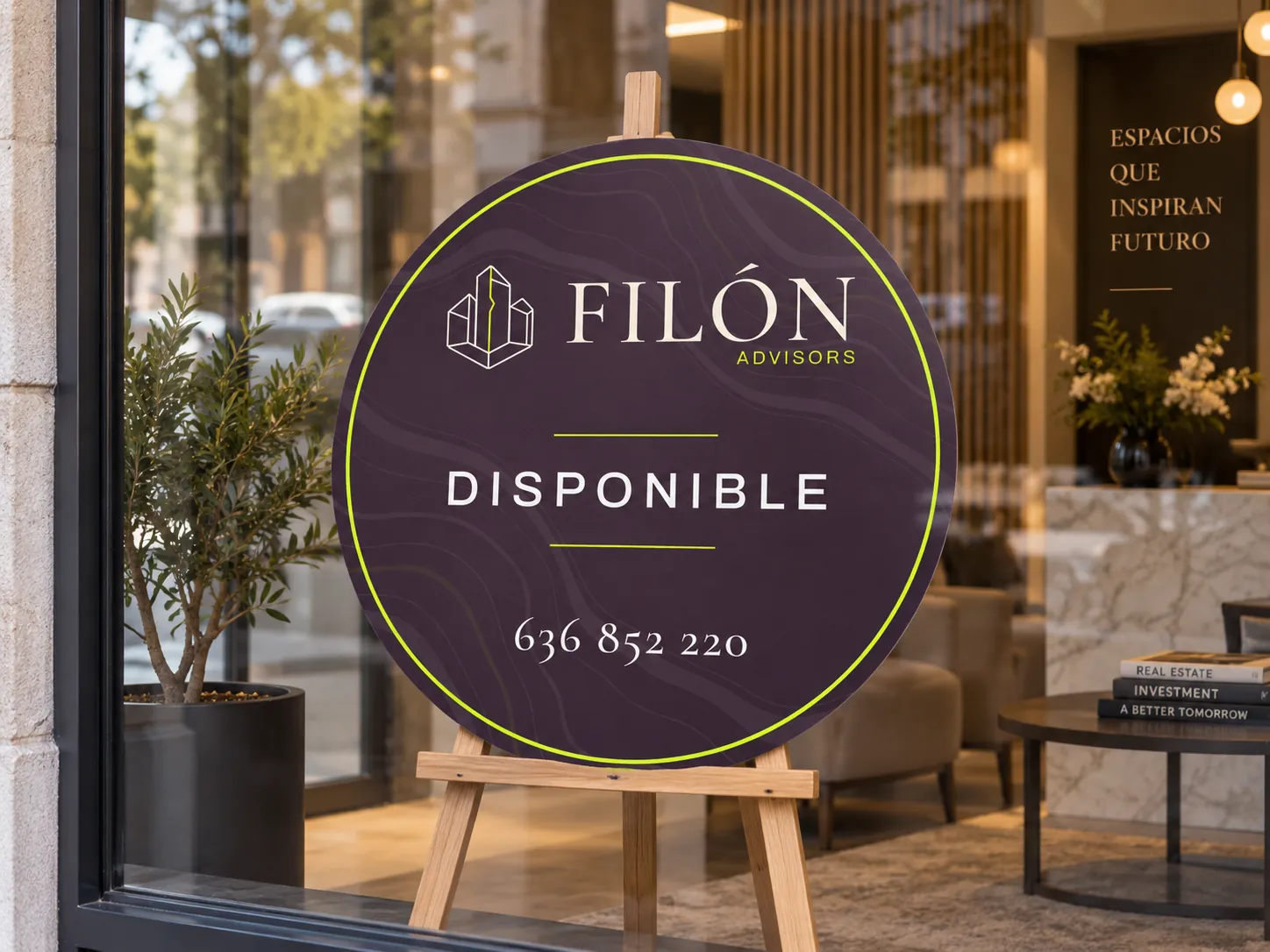
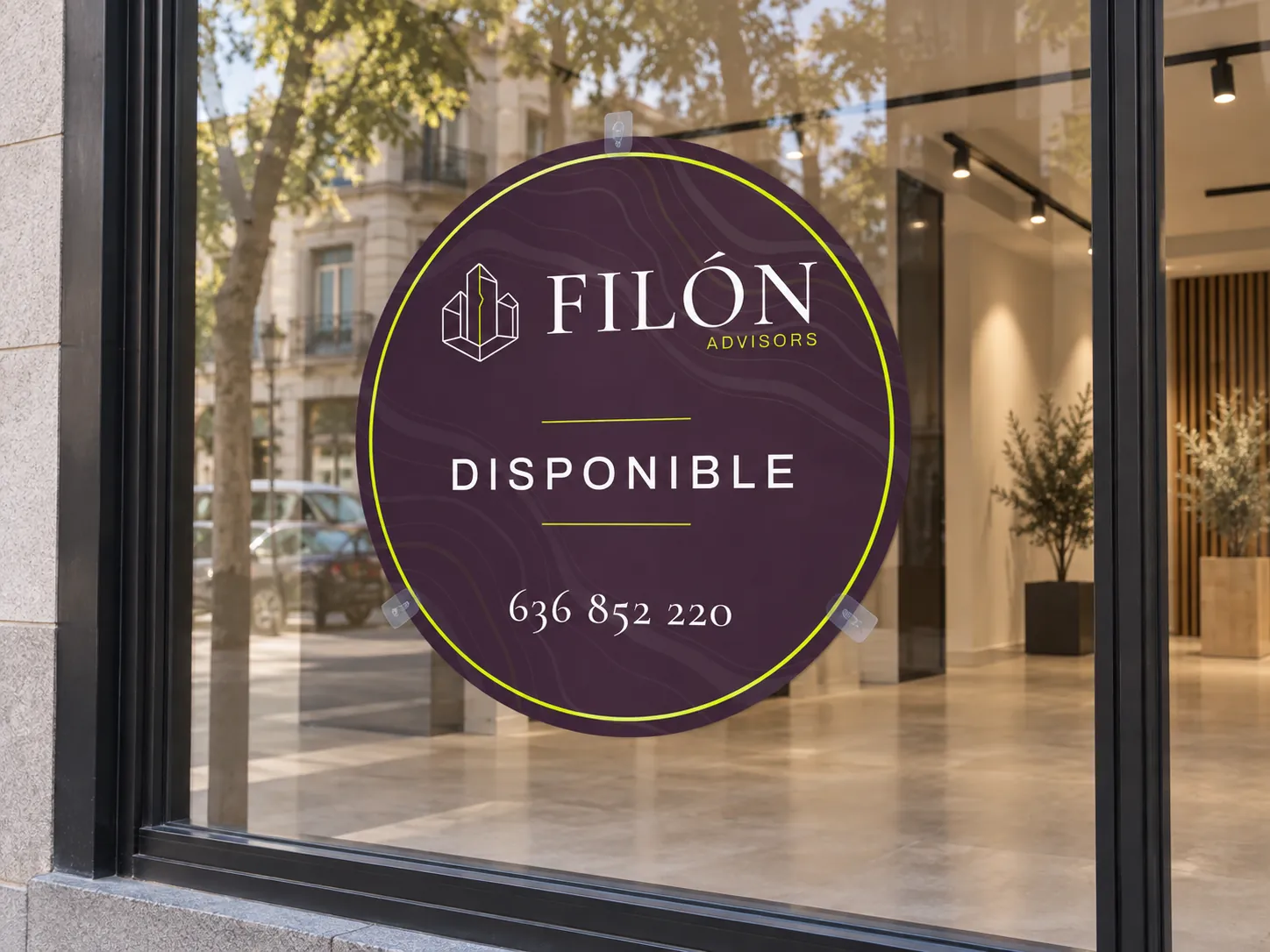
Round signs built to print at 1000 and 1500 mm, with eyelet versions for hanging: “Disponible” in three colourways for the shopfront, and a version that asks owners if they want to sell or let theirs. I prepared the press files and fixed them with the print shop.



Thirty seconds, from the rooftops to the vein.
The site needed a hero that explained the name without words. I directed it as one continuous camera move: Madrid from above, down to one corner building, through the pavement, and through three layers of rock where the vein glows brighter the deeper it goes.
- 01KeyframesEleven stills to lock the story, the light and the three depths before any motion.
- 02ReferencesFive approved images: sky view, street view and one per rock layer.
- 03Clay guideA grey 3D blockout that sets only the camera path. Models drift; a path doesn’t.
- 04SeedanceCalled through the BytePlus API from my own scripts: references + clay video + prompt.
- 05480p draftEvery take is judged cheap first. Only an approved draft is promoted.
- 061080p masterThe same task re-rendered at full size, watermark off, then cut for the web loop.
RuleThe clay video carries the camera, never the look. Surroundings stay muted; the chosen building is the only rich colour; the glow starts at the pavement and only grows.
Storyboard first, motion last.

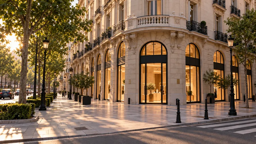
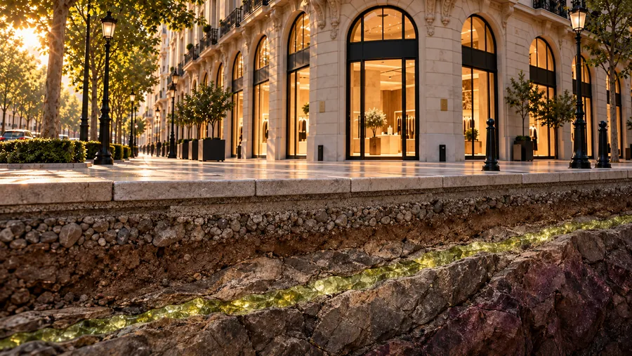
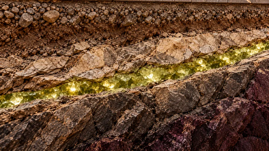
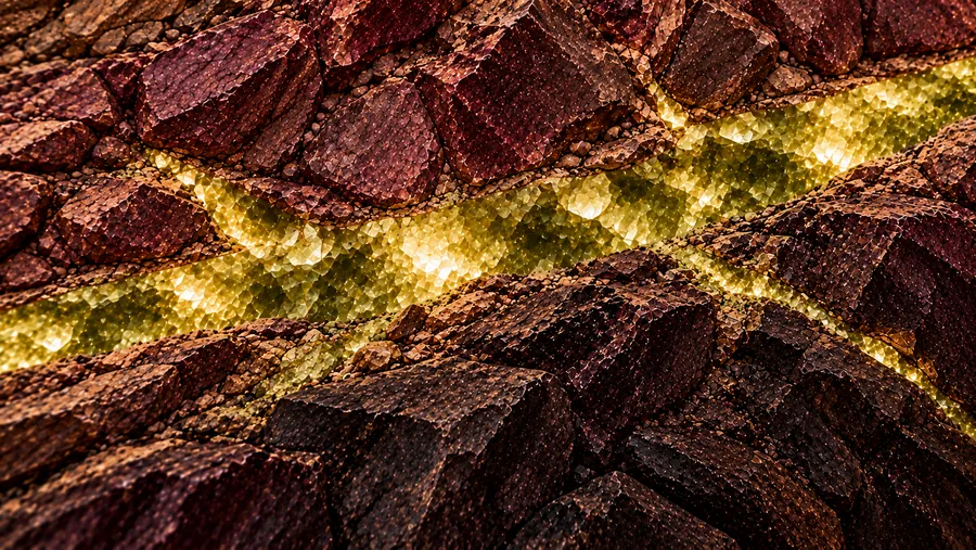
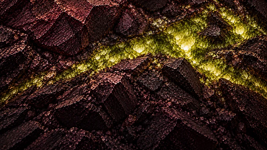
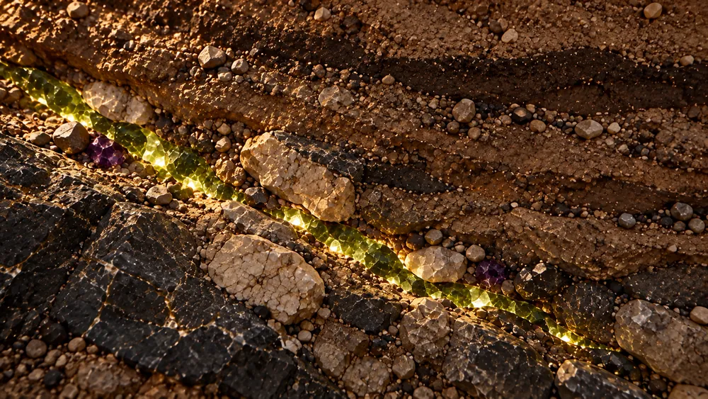
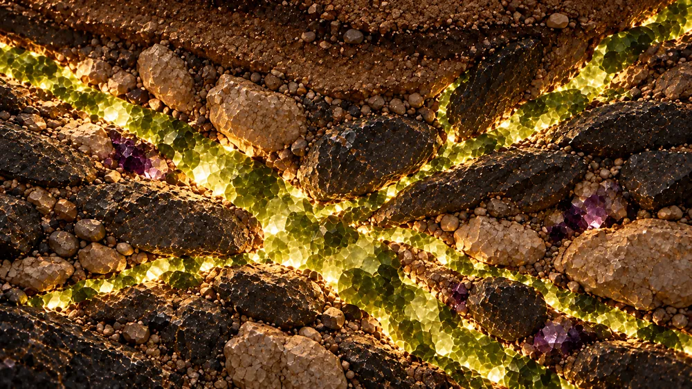
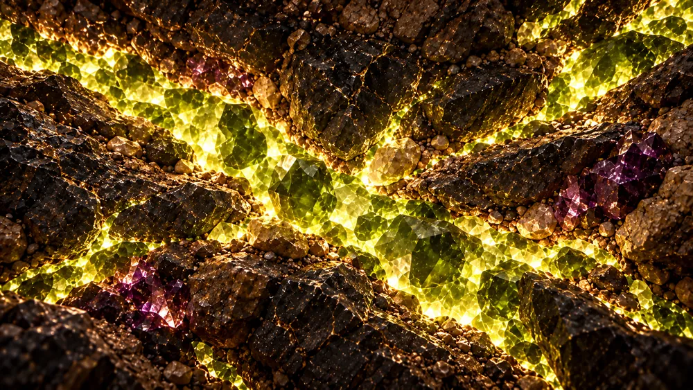
Grey boxes in, a film out.
The clay guide is deliberately ugly: blocks, a corner tower, a lime ribbon for the vein. It tells the model where the camera goes and nothing else, so the look comes only from the references and the prompt.
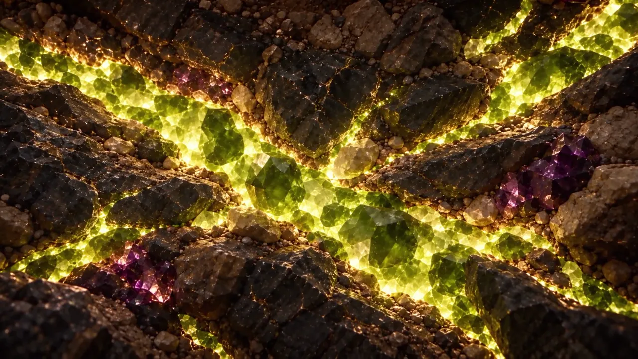
What it did, what I decided, where it failed.
What the AI does
- Generates the keyframes and the rock-layer references from my prompts.
- Seedance turns references, a clay camera path and a prompt into one continuous 30-second shot.
- Fills in what a shoot couldn’t: a camera that flies through a pavement.
What I decided
- One camera move, no cuts. The story is the descent.
- Motion is guided by geometry, not by words. The clay guide removes the guesswork.
- Draft at 480p, promote only the approved take to 1080p. Credits go to the take that already works.
- Muted city, rich building, vein that grows. Colour does the explaining.
Where it fails
- Endings. Takes held together for 20 seconds, then collapsed into a crystal cave nobody asked for.
- Literal morphing between references. The prompt had to forbid it.
- Drift: without the clay path, the camera wandered off the building.
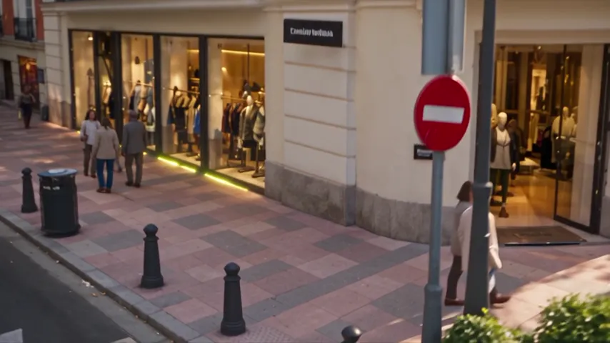
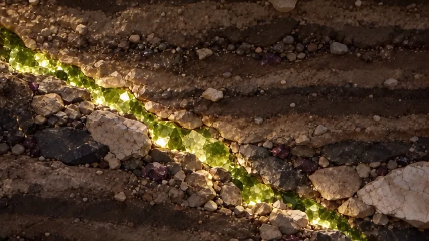
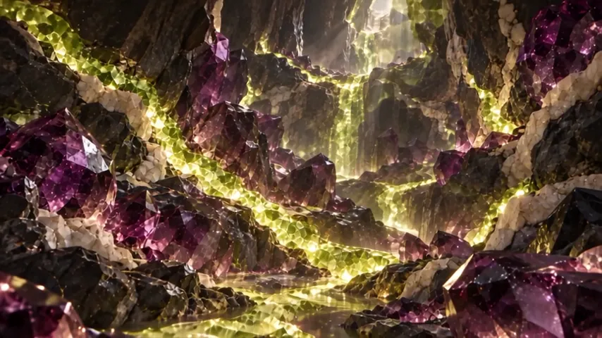
An investment firm’s site that explains itself.
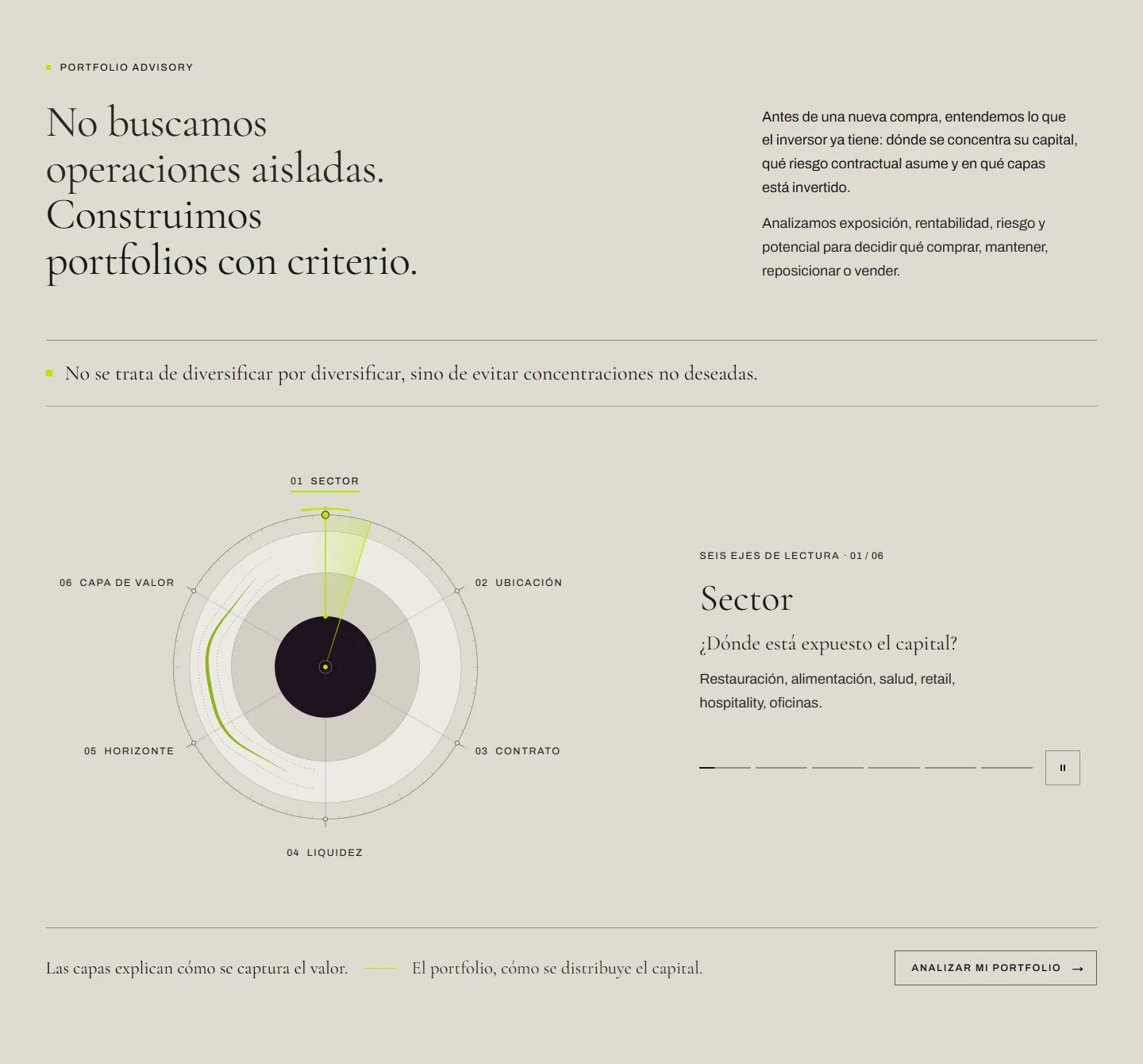
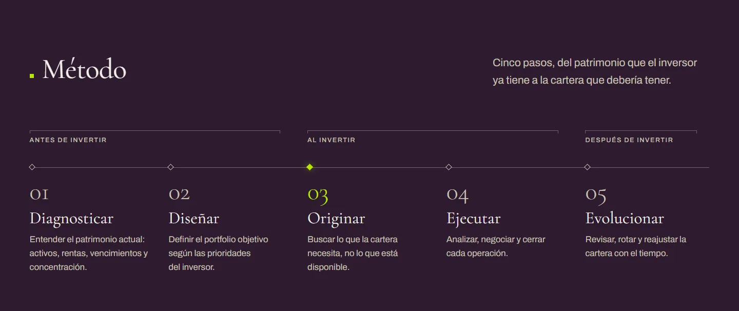
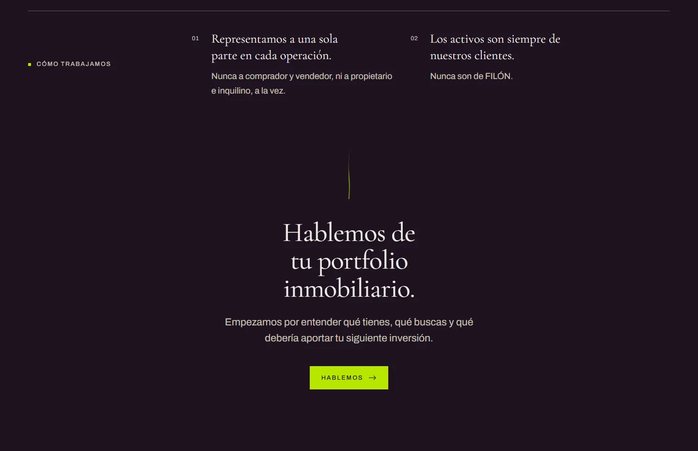
The film opens the home page. Below it, the site turns the brand idea into the firm’s actual method: three depths of value on an isometric building, a six-axis portfolio reading, five method steps and the services. Designed and built by me in Next.js, in Spanish.
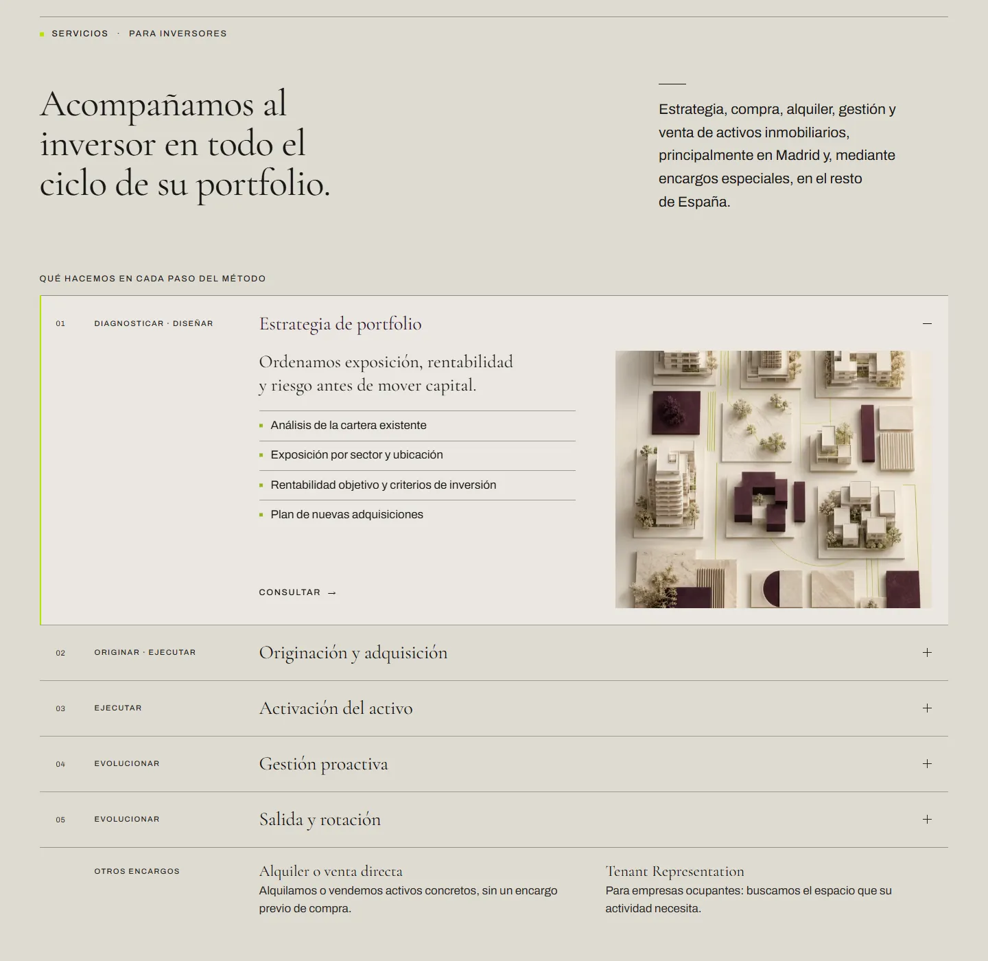
From brief to a site that takes leads.
- 01
Next.js 16 on Vercel, built with Claude Code. Brand tokens live in the code, so the site and the print files share one palette.
- 02
A contact form that feeds a private leads dashboard for the firm.
- 03
Legal pages adapted to the firm and reviewed by its lawyer before launch.
- 04
Film pipeline in Python against the BytePlus API: draft, review, promote, with the task ids logged for every take.
[02]Next project
From a film to a brand manual.
Commercial brand work: the manual, the ads and the product UI for a senior-living marketplace.
Senior Market / miResi
Brand manual · Advertising · UX/UI · 2025
A nine-chapter brand manual, advertising across four placements and the marketplace UX/UI.
View next project
Back to selected work